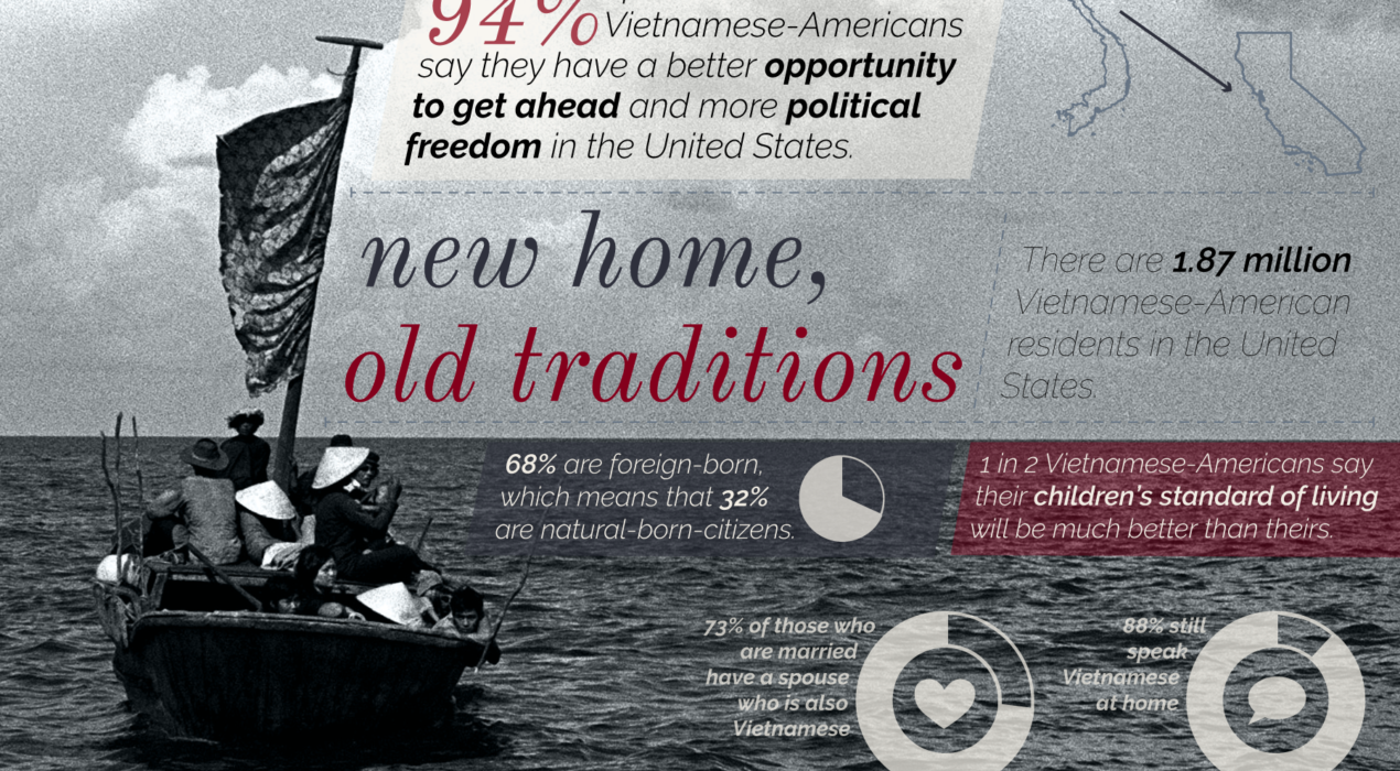
Old home, new traditions
The Task: Assignment for ASCJ200: Navigating Media and News in the Digital Age; design an infographic that tells a story about a specific topic or group (chosen previously in the semester to be studied throughout the course). The Process: The topic I chose to study for ASCJ200 was Vietnamese-Americans, specifically their refugee heritage and how it affects them today. While I was originally interested in statistics about the two waves of Vietnamese immigration, I found that surveys about Vietnamese-American attitudes about the nation and behaviors were far more interesting and told a more interesting story about the integration of the two cultures; Vietnamese-Americans take one aspects of both cultures, holding on to many traditions while feeling at-home in American. In order to capture the combination of two cultures, I selected a well-known photo depicting “boat people” and the colors of the American flag. Programs Used: Adobe Illustrator CC, Adobe Photoshop CC
Read More ›
Multicultural mosaic
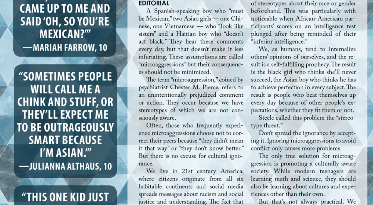
The Task: Design a page serves as the introduction to a multicultural package in the Feb. 2016 [R&B] magazine. The Process: I wanted a design that is very eye-catching but not too busy. I chose to use a mosaic-like pattern because it was very appropriate for the central theme of the package and the magazine, the way every individual at Hillsborough is unique but helps make our school the way it is. the With this magazine, I had more design freedom than I’d ever had with a newspaper. I’ve never been daring enough to use textures in the newspaper because our printing tends to run dark and blur fine details, but I was able to use a watercolor-like texture here. Programs Used: Adobe InDesign CC, Adobe Photoshop CC
Read More ›
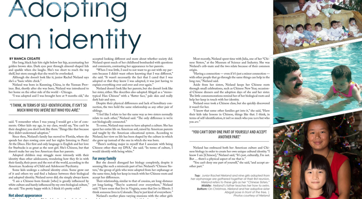
Adopting an identity
The Task: Design a two-page spread as a part of a section on multiculturalism in [R&B] student magazine. The Process: With newspaper design, I often feel limited by the lower printing quality and the white borders that surround every page. The design possibilities seemed limitless when we began working on R&B, our special edition magazine. The full-bleed printing gave me more space than I’d normally have with a newspaper, which allowed me to have plenty of white space. I decided on a simple, geometric design to give the reader “breathing room” after the very bright design on the previous page. The extra wide gutter between the second and third columns was designed to accommodate the specifications for the fold at the center, and the gutter will appear smaller in the printed magazine. Programs Used: Adobe InDesign CC, Adobe Photoshop CC Note: this spread may be subject to change prior to the printing of the Feb. 2016 R&B magazine.
Read More ›
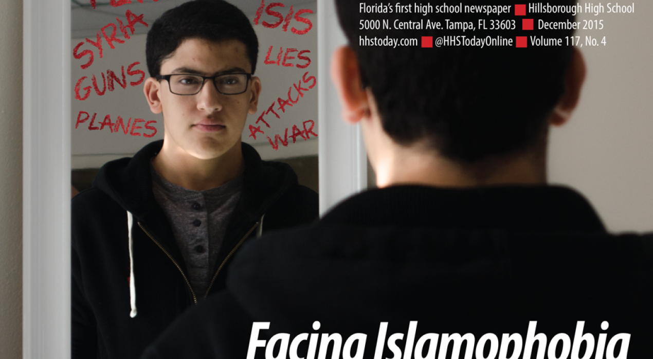
Putting a face on Islamophobia
The Task: According to the Society of Professional Journalists, it is the duty of journalists to "give voice to the voiceless." But, for this issue of the Red & Black, I wanted to do even more; I wanted to put faces on the faceless victims of Islamophobia, and make our audience realize that the same people they call "terrorists" and "killers" are normal students at our school. The Process: I've done a lot of candid photography for the Red & Black over the years, but this was the first time I've ever attempted posed portraits. Armed with only a sheet of construction paper, one softbox and my Nikon D5100, I set out to capture portraits that highlight the gravity of Islamophobia. Though I initially planned to write on the mirror in the front page photo, the effect was not dramatic enough, so I added the words in Photoshop CC. I argued with my adviser and co-editor-in-chief -- both of whom wanted the words to cover Megahed's face -- but I opted to leave his face exposed to keep the "human-ness" of the photo and show his expression. Equipment & Programs Used: Nikon D5100, one softbox, Adobe Photoshop CC, Adobe InDesign CC […]
Read More ›