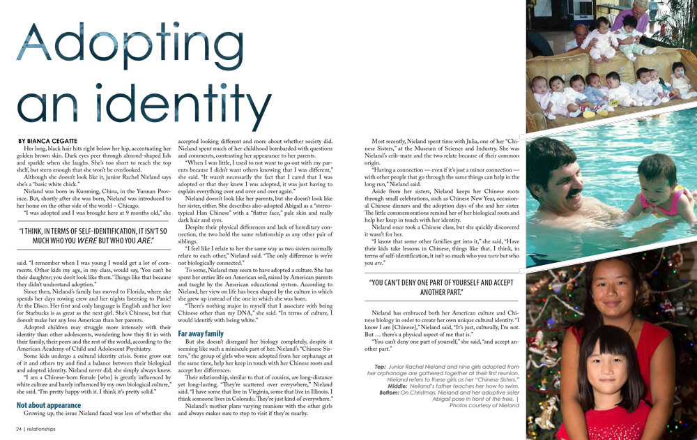
The Task: Design a two-page spread as a part of a section on multiculturalism in [R&B] student magazine.
The Process: With newspaper design, I often feel limited by the lower printing quality and the white borders that surround every page. The design possibilities seemed limitless when we began working on R&B, our special edition magazine. The full-bleed printing gave me more space than I’d normally have with a newspaper, which allowed me to have plenty of white space. I decided on a simple, geometric design to give the reader “breathing room” after the very bright design on the previous page. The extra wide gutter between the second and third columns was designed to accommodate the specifications for the fold at the center, and the gutter will appear smaller in the printed magazine.
Programs Used: Adobe InDesign CC, Adobe Photoshop CC
 Loading...
Note: this spread may be subject to change prior to the printing of the Feb. 2016 R&B magazine.


